A B2B distribution management platform that helps Finviet streamline order flows between distributors and retailers across Vietnam.
Ecom Portal is the back-office platform of Finviet's B2B commerce ecosystem. It is used by Finviet administrators and regional distributors (NPPs) to manage the full order lifecycle — from creation to delivery — for thousands of small retailers across the country.
The portal sits at the center of a distribution chain: Finviet NPPs sell to retailers (tạp hoá, đại lý), and every order, approval, and status update flows through this system.
I joined as a UI Designer on this platform at Finviet. My focus was on the visual and interaction layer — making the existing workflows cleaner, more consistent, and easier to use. I applied a shared design system across modules and worked with operations staff to identify usability friction and improve it.
The portal was already functional — the core features existed and the business logic was in place. The challenge was that the interface had grown without a consistent visual language. Different modules looked and behaved differently, making it harder to learn and slower to use.
"I need to see all pending orders from my retailers right now and approve the ones that are ready to ship — without clicking through ten screens."
NPP Operations Staff
"I need to know which NPP has the most cancelled orders this month and why, so I can intervene before it affects revenue."
Finviet Admin
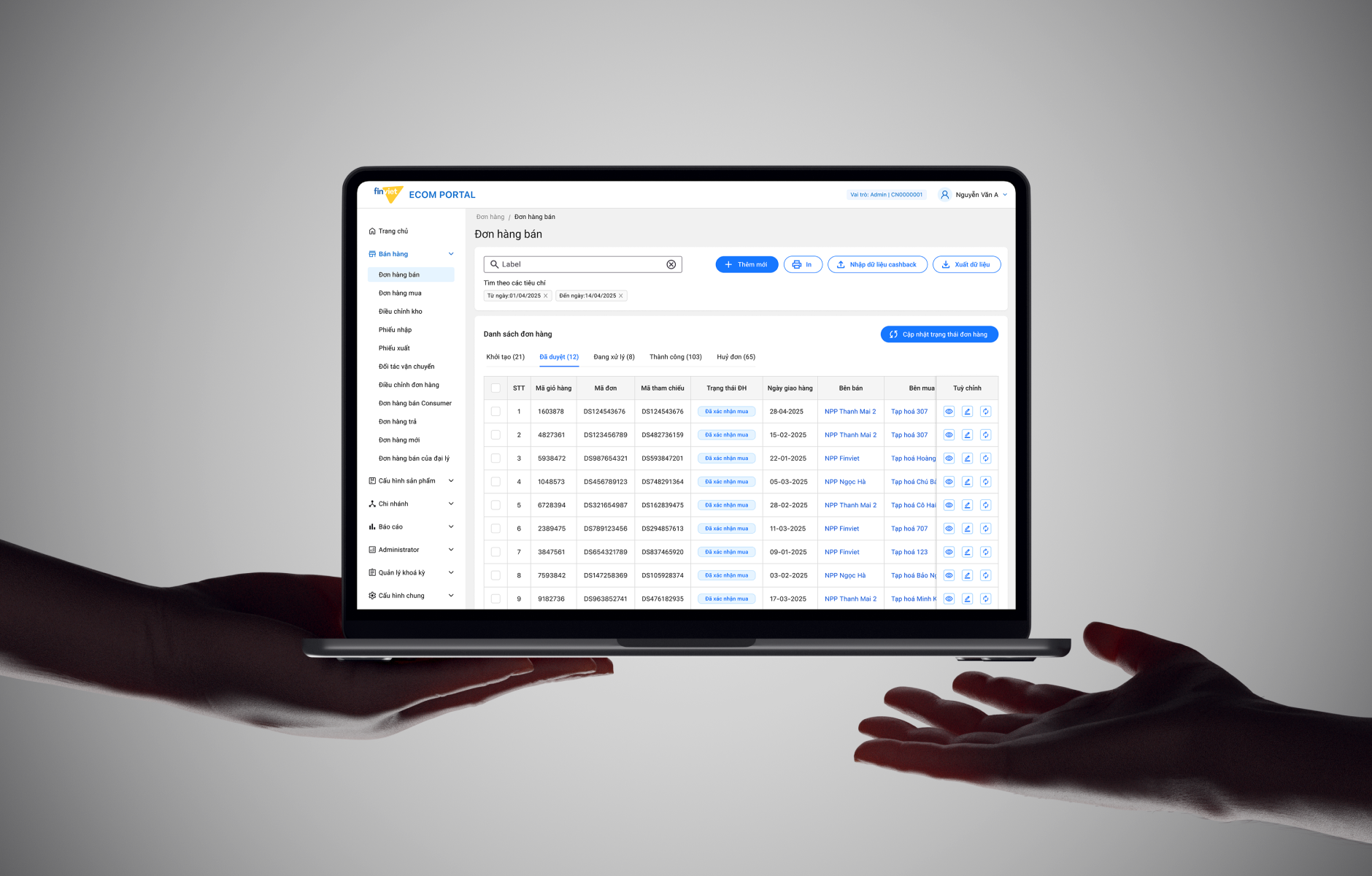
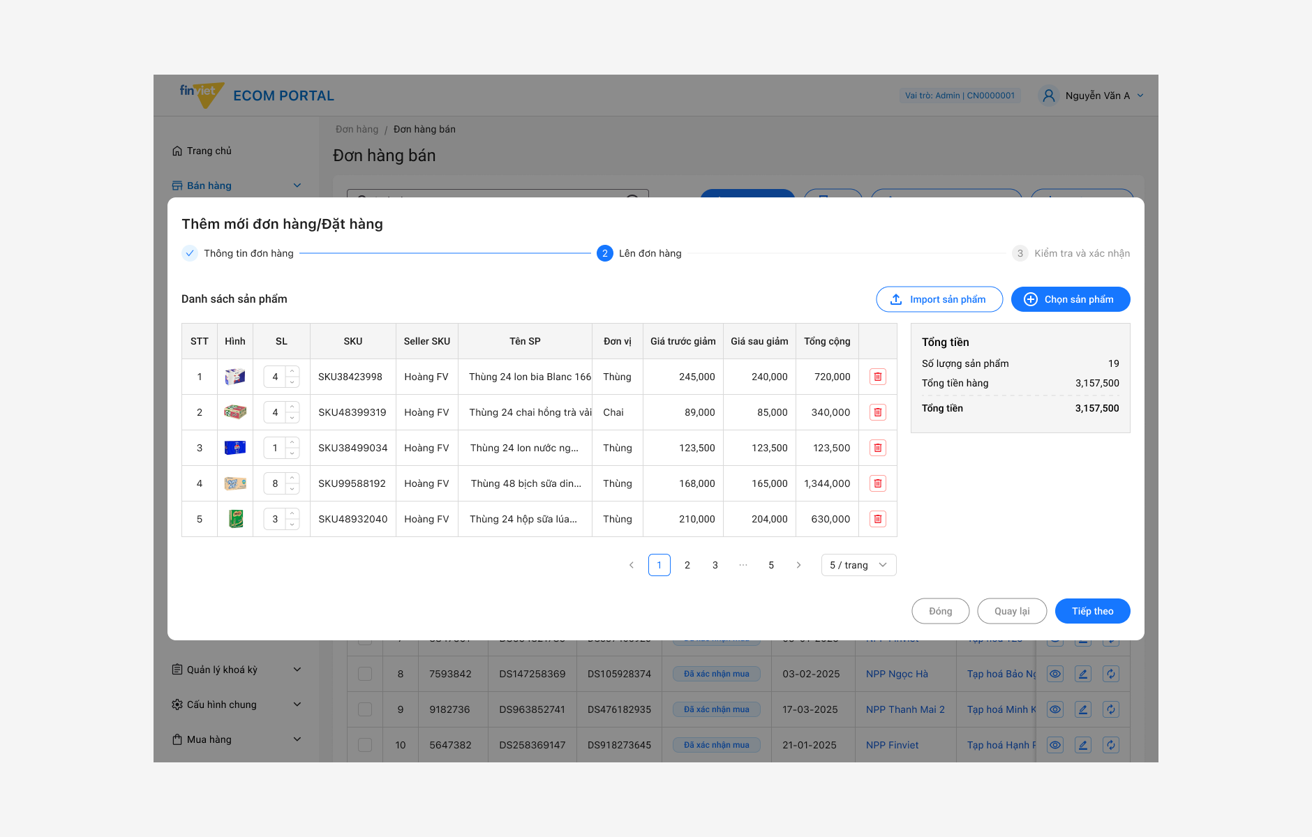
I used horizontal tabs to segment orders by status instead of a dropdown filter. NPP staff typically need to process all "pending approval" orders at once — tabs make the active count visible immediately and require one click to isolate the relevant set. Filters are still available for date and reference, but status is always the first cut.
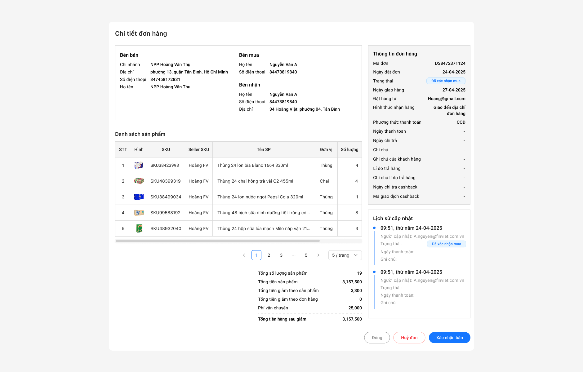
For the most common actions — viewing an order summary, updating status, or printing — I kept them accessible directly from the table row. Only complex edits require navigating to a detail page. This reduced the round-trips users had to make during high-volume processing windows.
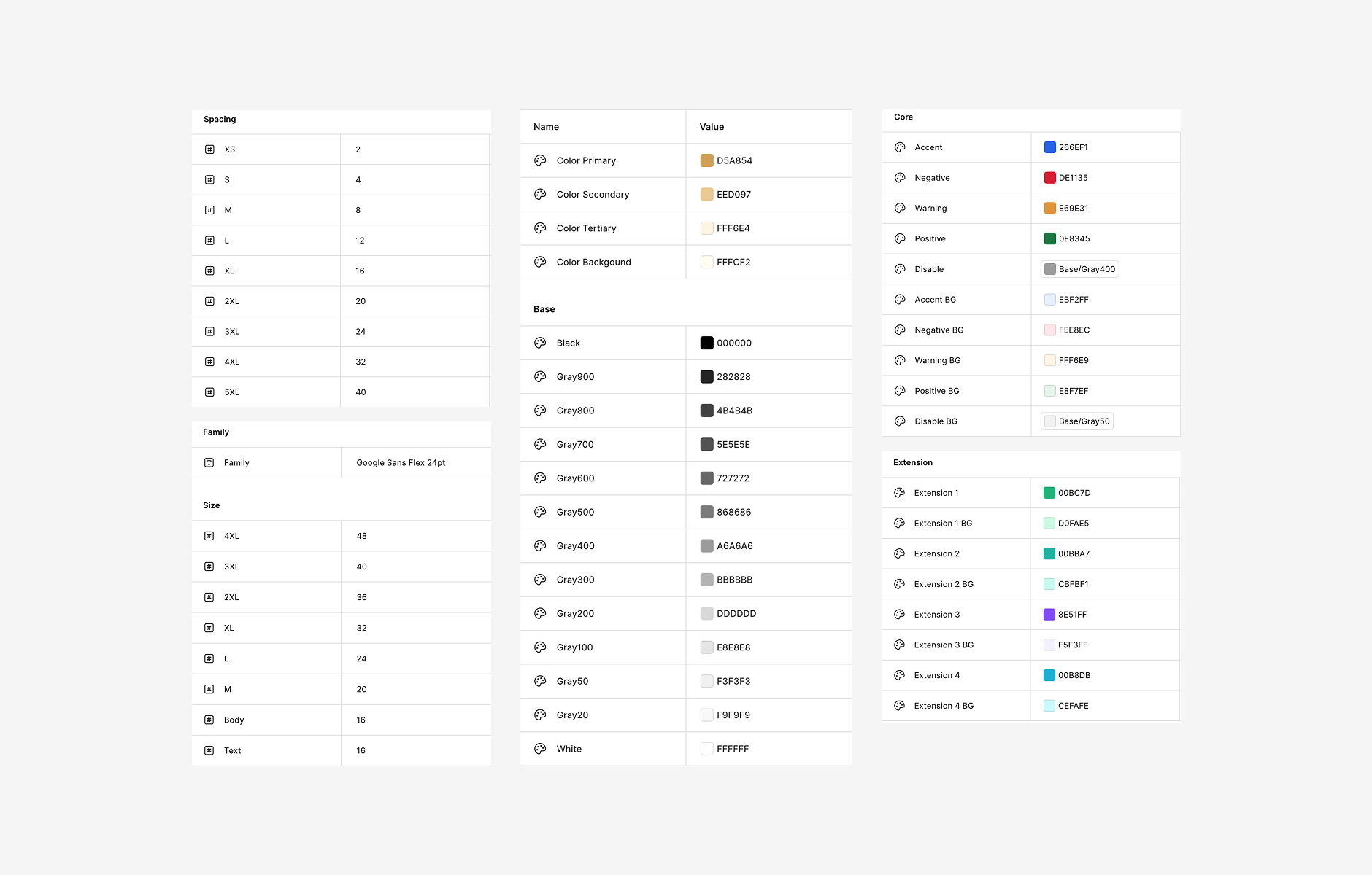
Rather than designing each module independently, I built a shared component set: the same table structure, the same filter bar, the same action icon style. Users who learn orders can immediately use inventory and returns without re-learning the interface. This also made development faster as components were reused.
Instead of hiding modules entirely from NPP users, the portal shows them with appropriate scope. An NPP sees only their own orders and warehouse — not other NPPs' data. This made the mental model simpler: the portal is the same tool for everyone, just scoped to your context.
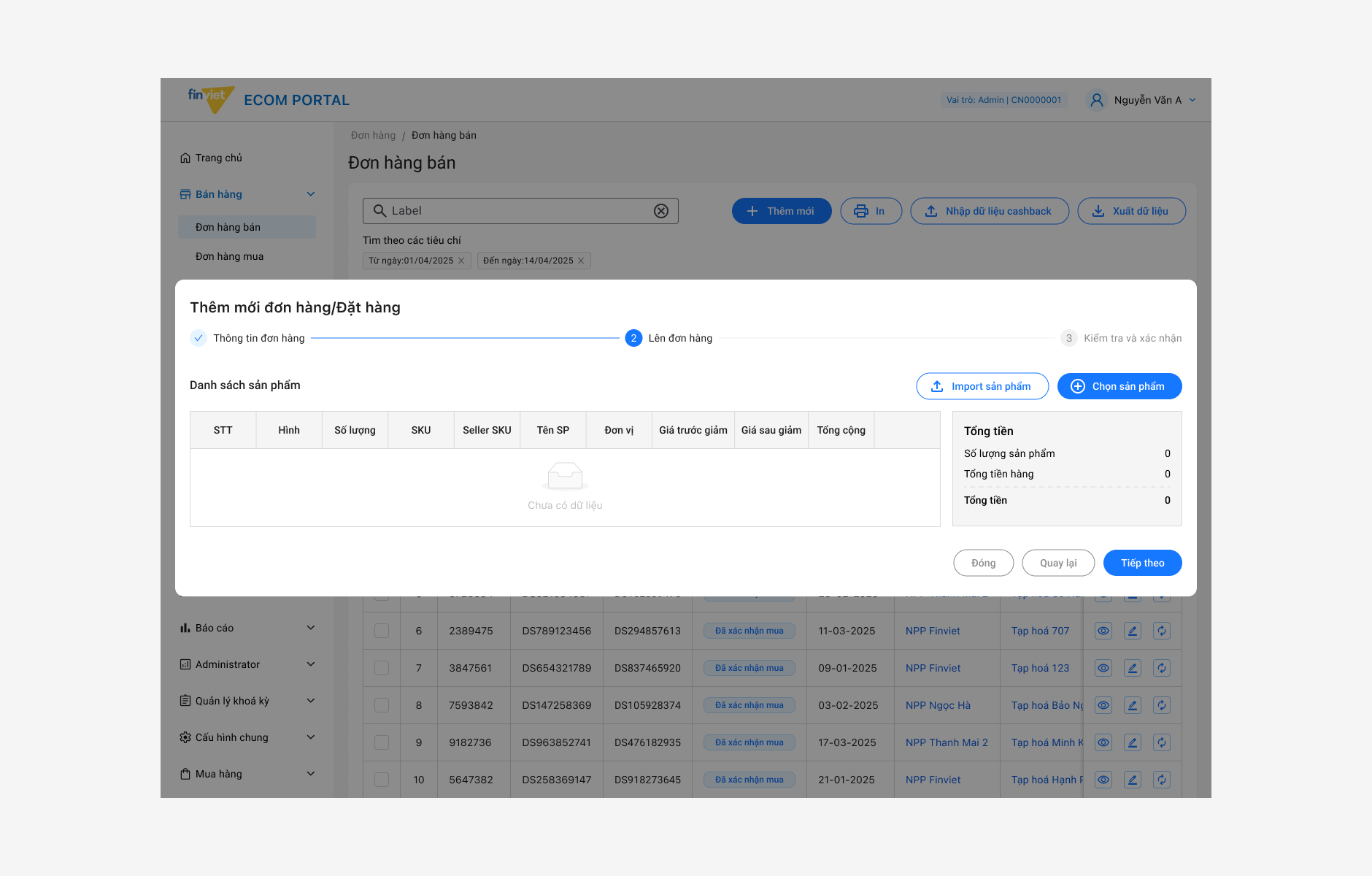
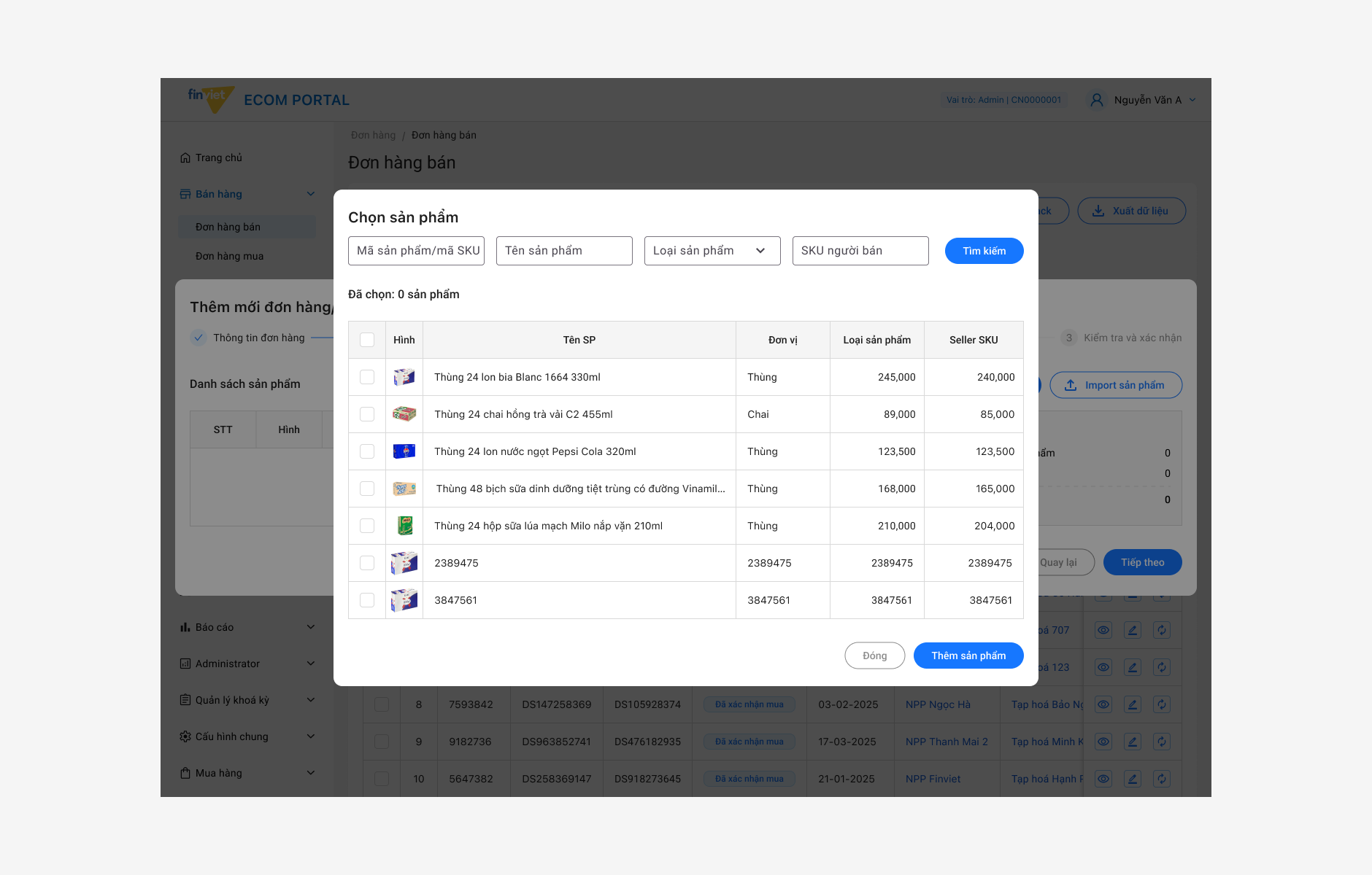
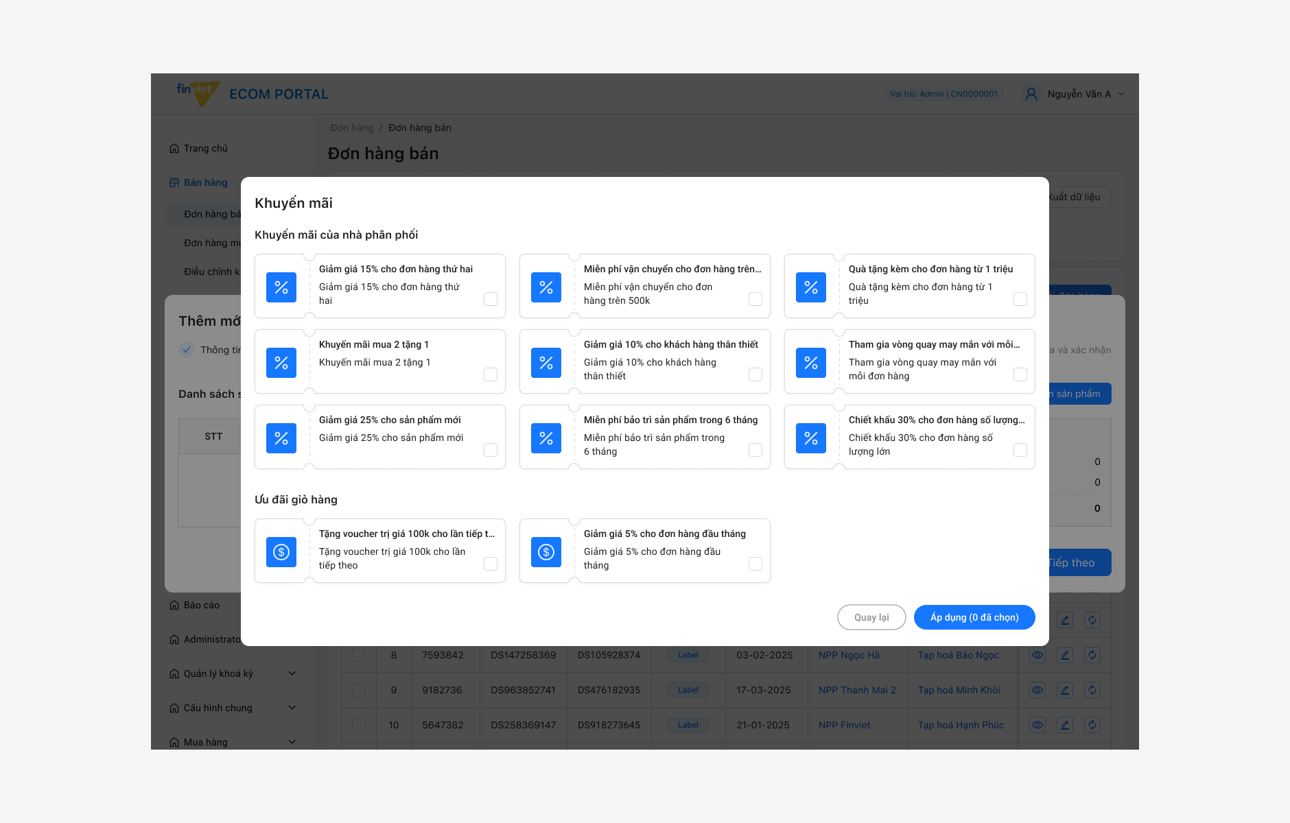
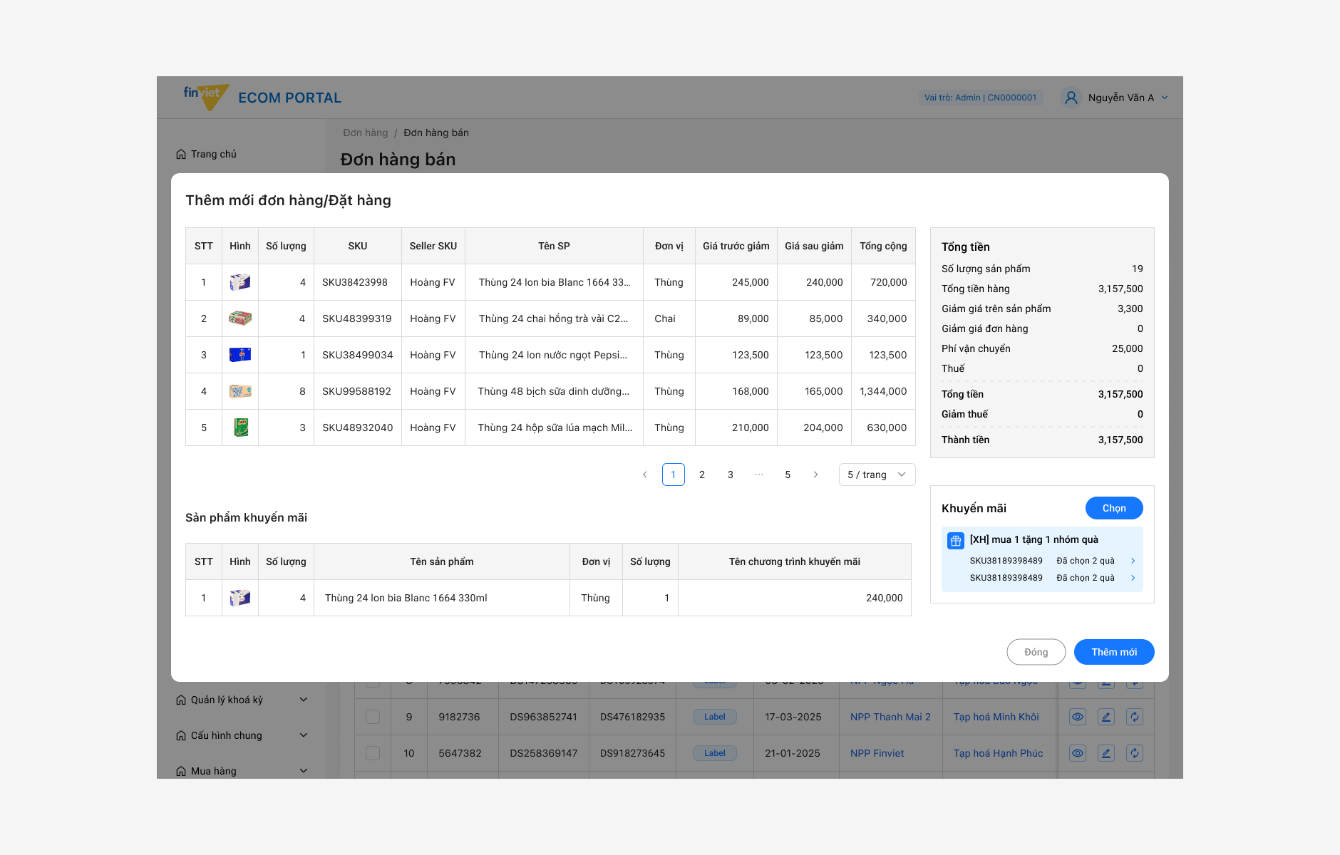
A look at key screens from the portal — focusing on the order management interface, table layout, and the design system applied consistently across modules.
Working on this project, I learned that good design for a work tool means making things simple and clear. Users do not have time to figure out a confusing interface — they just want to finish their tasks. I also learned that building a consistent UI from the start saves a lot of time later, because new features can be added without changing everything else.
Designing for operations taught me that the best interface for a busy user is one they never have to think about. When the design works, they just work.
Designer's note