Kiosk Ordering System
A self-service kiosk for restaurants and schools — helping customers order food faster and helping parents manage their children's meals at school.
What is this project?
This project is a self-service kiosk with two main use cases:
My role
I was the UX Designer on this project. I worked with a product manager and developers. I was responsible for user research, user flows, wireframes, UI design, and usability testing.
What problem are we solving?
Before this kiosk, both restaurants and schools had the same problem: long queues and slow service, especially during busy hours.
- Customers wait too long to order
- Staff spend too much time taking orders manually
- Mistakes happen when orders are taken by hand
- Students crowd the canteen during recess
- Staff cannot handle many students at once
- Parents cannot easily control what their children eat
Business goals
For restaurants: Reduce the time from "customer arrives" to "order is placed." Make checkout faster and easier.
For schools: Help parents pre-order meals for children. Reduce pressure on canteen staff during peak hours.
Who are the users?
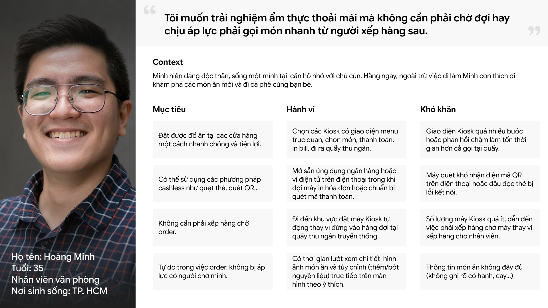
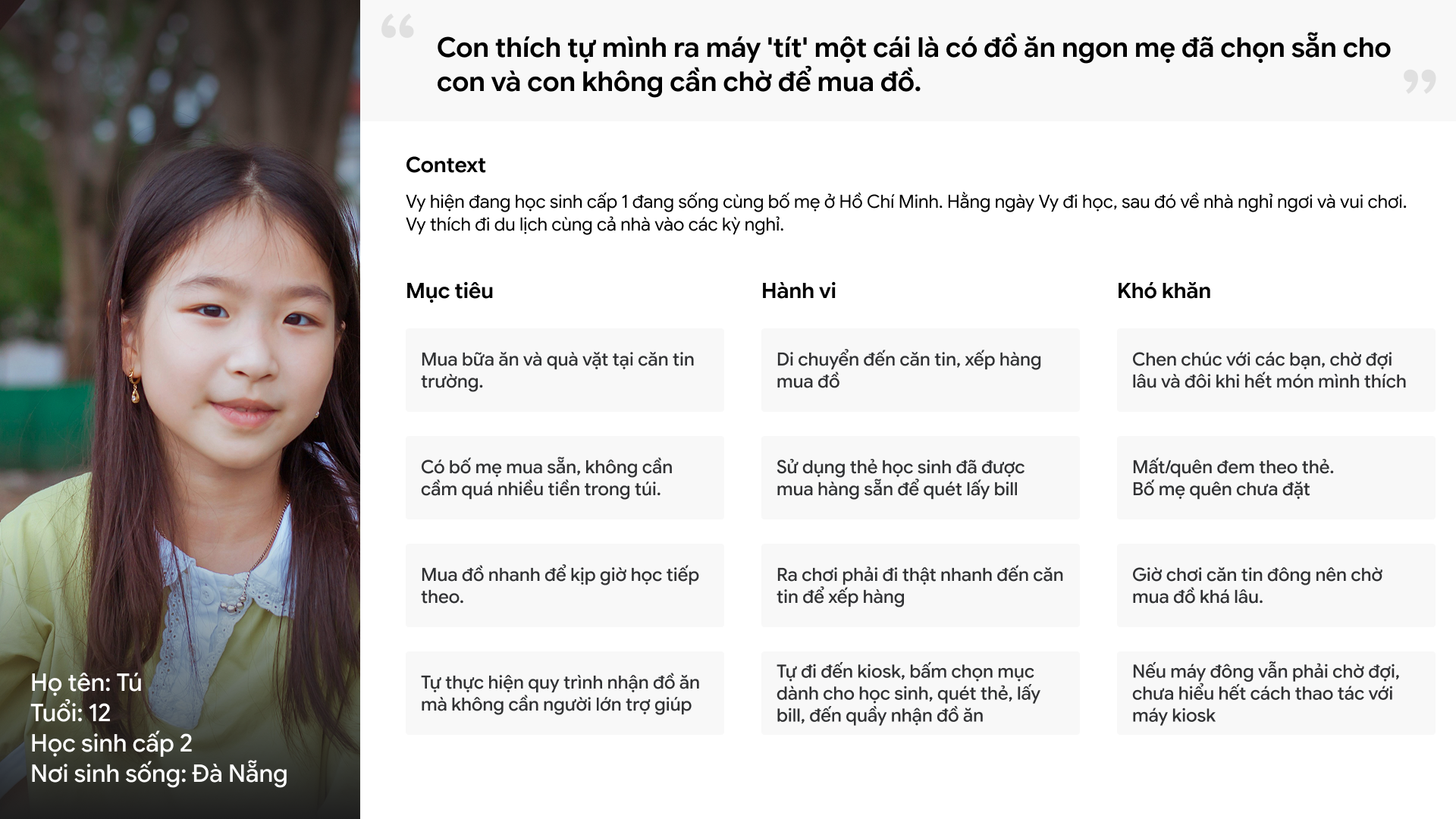
Key jobs to be done
"I want to order my lunch in under 3 minutes so I don't waste my break time."
— Restaurant customer
"I want my child to get the right meal quickly, without standing in a long queue."
— Parent
How did I approach this?
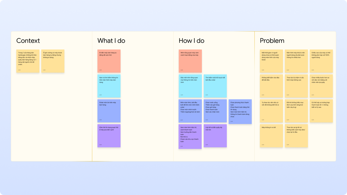
Step 1 — Understand the context
I started by looking at how people order food in restaurants and schools today. I observed how long queues form, where people get confused, and what causes delays.
I also looked at other kiosk products (like McDonald's) to understand what works well and what we could do better.
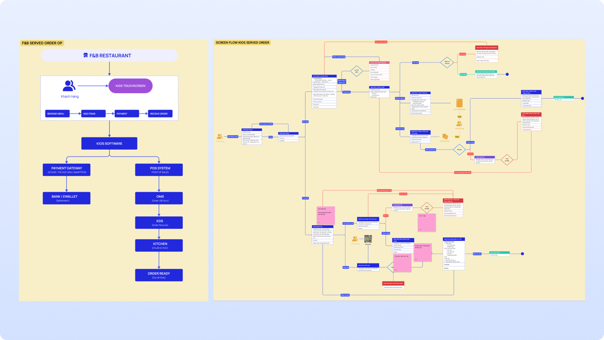
Step 2 — Define the user flow
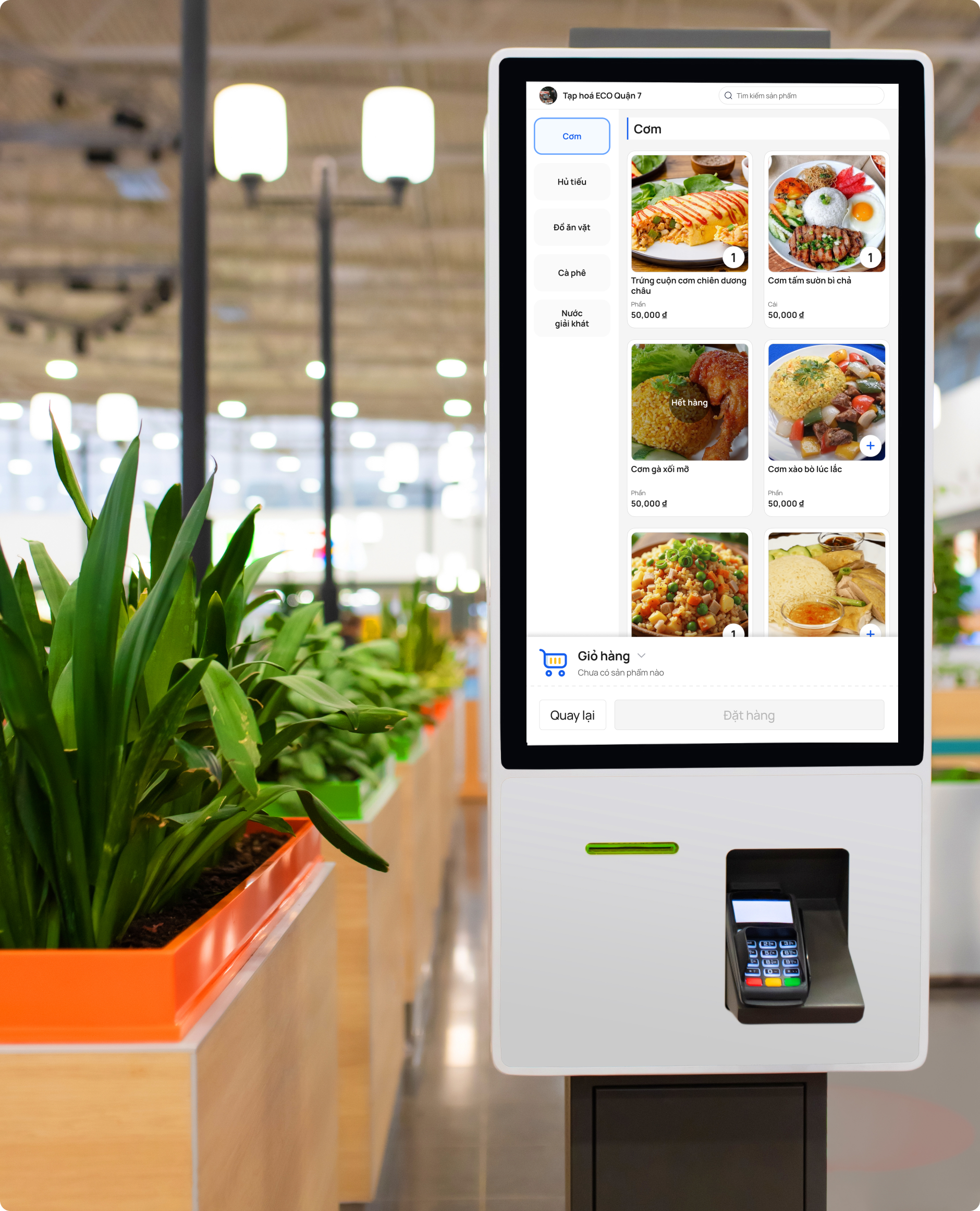
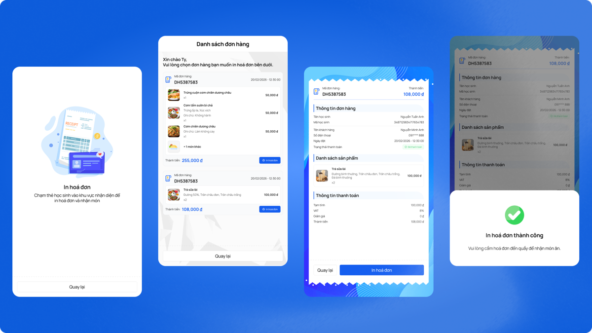
I created separate user flows for the two contexts. The restaurant flow focuses on speed: browse → select → pay. The school flow focuses on simplicity: scan/enter student ID → confirm pre-ordered meal → done.
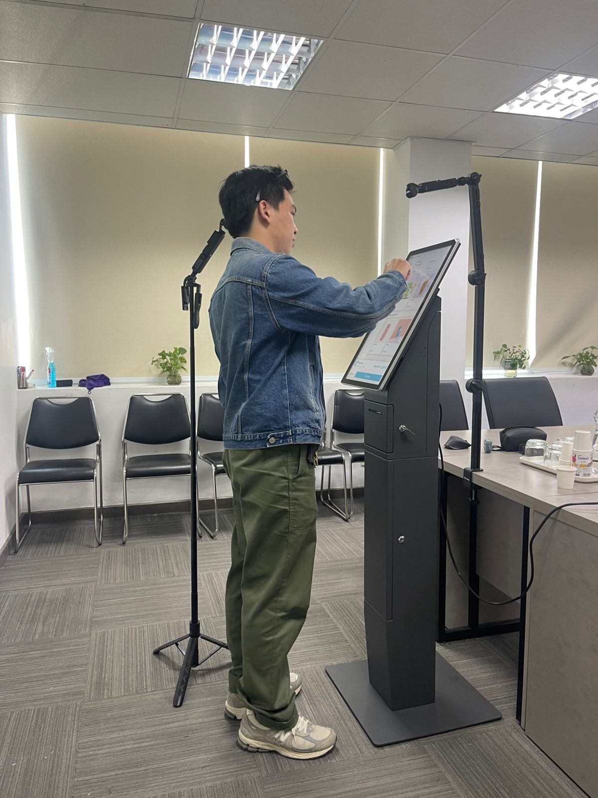
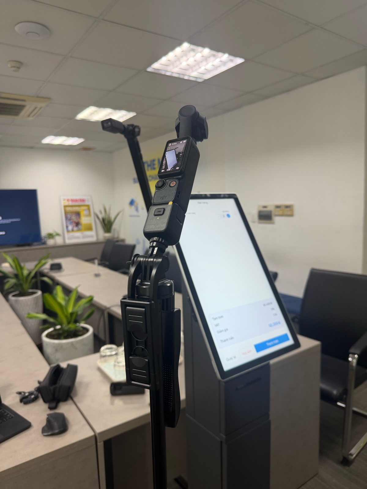
Step 3 — Ergonomics research
This was a key part of the design. A kiosk is a physical product, so the screen position and button placement matter a lot — especially because our users include children.
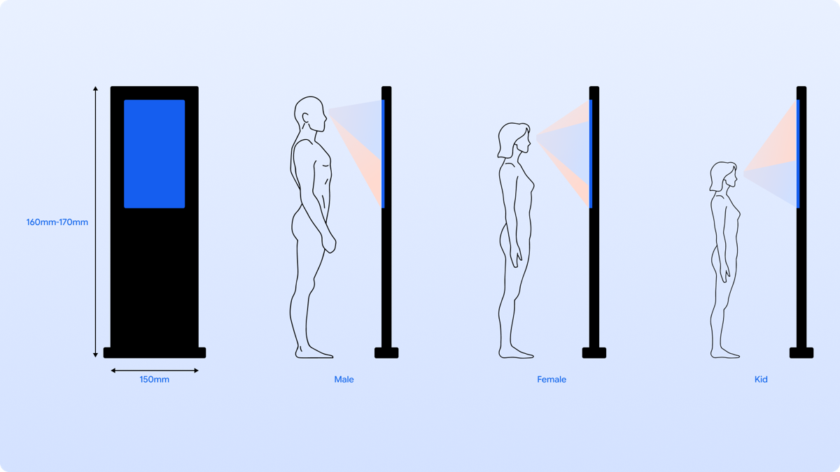
Screen height
Based on the average height of Vietnamese users (140 cm–168 cm), I recommended placing the screen center at 110–120 cm from the floor. This height works for both children and adults without anyone needing to bend or stretch.
Touch target placement
I placed all main buttons (add to cart, pay, confirm) in the lower half of the screen. Children at 140 cm tall cannot easily reach the top corners, so I avoided putting important actions there.
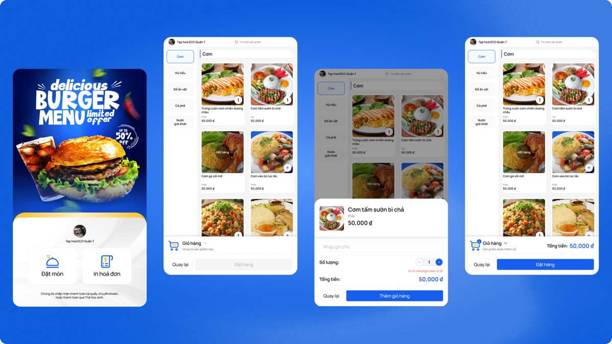
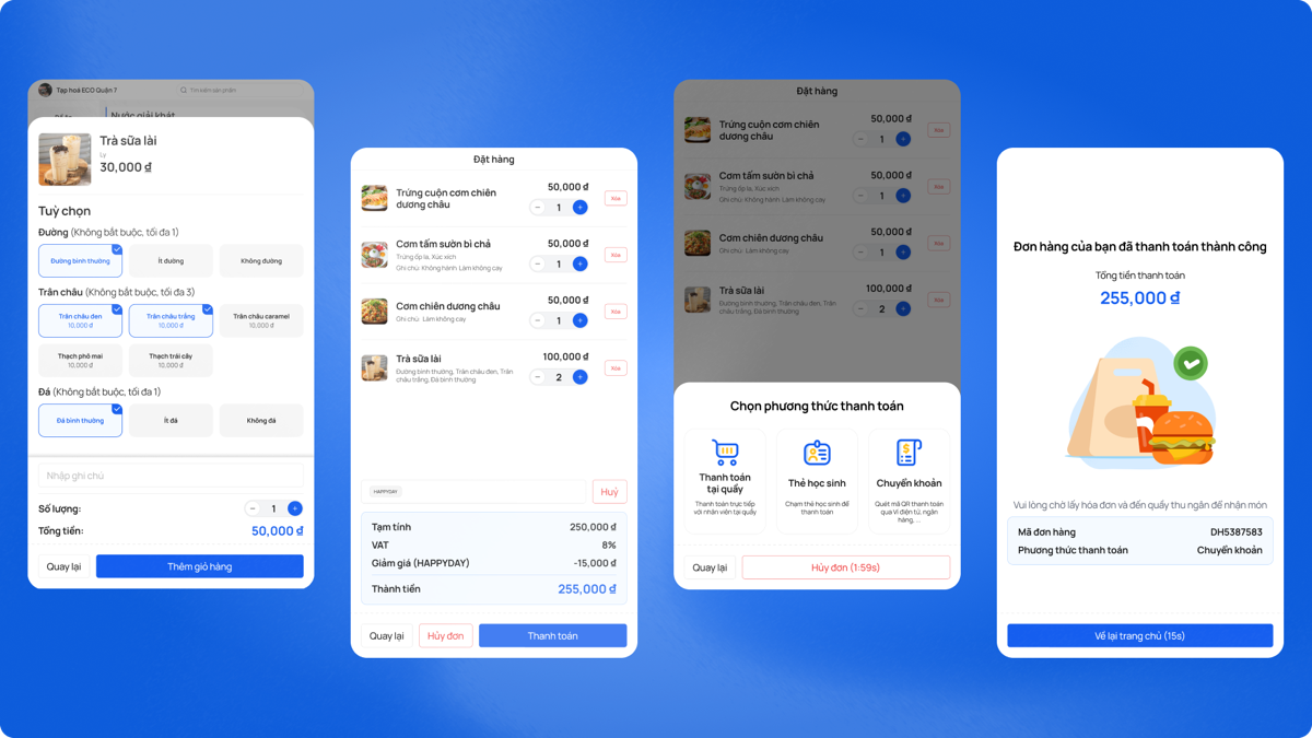
Step 4 — UI design
I designed the UI with these principles in mind:
Key decisions I made
Decision 1 — One kiosk, two modes
I chose to design one kiosk that supports both use cases (restaurant and school), but with different entry flows. This reduces hardware cost and maintenance for the business, while still giving each user type the right experience.
Decision 2 — All important buttons in the bottom half
Based on ergonomics research, I made a strict rule: no critical action button in the top half of the screen. This was a direct response to the needs of younger users. It also makes the experience more comfortable for adults who do not want to reach up.
Decision 3 — School flow = 2 steps only
For students, the goal is speed. They already have a pre-ordered meal. So I reduced the school pickup flow to just 2 steps: (1) identify yourself, (2) confirm and collect. This minimizes time at the kiosk during busy recess.
What did we test?
Before finalizing the design, I ran usability testing sessions with real users to check if the design worked as intended.
What we tested
- Can users find and add items to cart?
- Is the checkout flow clear?
- Do users understand the payment step?
- Can children identify themselves easily?
- Can they confirm the right meal?
- How long does the whole flow take?
What we found and changed
Testing helped us find a few problems early. For example, some users did not notice the "confirm" button because it was too similar in color to the background. We made it more visible by increasing contrast and size.
We also found that children sometimes pressed the wrong item by mistake, because buttons were too close together. We added more spacing between items in the menu grid.
What I learned
- 1 Design for the smallest user first. Designing for children (140 cm, small hands) automatically makes the product better for everyone else too. This is a form of inclusive design.
- 2 Physical context changes design decisions. A kiosk is different from a phone app. Screen height, reach zone, and lighting all affect how I design. I need to think beyond the screen.
- 3 Two contexts, one product. Designing for both restaurants and schools in one product taught me how to find shared patterns and where to separate the experiences.
- 4 Test early, especially with physical products. A kiosk cannot be updated like an app. Finding problems before production is critical. I would invest even more time in prototype testing next time.